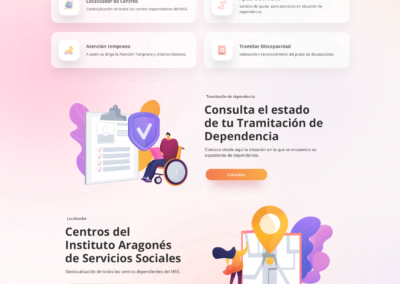
100% Custom Web Design
This project was initiated thanks to a public tender that was won to renovate the website of an institution that offered a public service at a state level. To do this, they were looking for the new website to ensure that it was able to meet and adapt to all the needs of the population accessing the public service.
total number of team members:
Five
Main role I played on the team:
UX Researcher
Project Duration:
Four Months
The Problem
The social services portal was not very accessible and was too complex to be efficient, and the user encountered constant problems in finding information or carrying out telematic procedures. Added to this was the difficulty that many of the users were elderly or with a low level of digitalisation.
The Solution
The study was divided into three samples, young, middle-aged and older people. A dynamic focus group, 15 user tests, an in-depth heuristic analysis and benchmarking of three competitors, together with an accessibility analysis, a SEO audit and a technical analysis of the technology to be used were carried out. This was followed by an analysis and synthesis of the results with concrete indications that should be included in the final design.
The Process
Focus Group
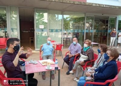
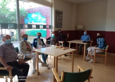
In order to approach the focus group, priority was given to the age segment that could present the most difficulties in terms of accessibility and that most often tried to use public web services. In this case, it was older people. The dynamics were created together with in-depth interviews with each of them in order to go into qualitative details.
The battery of questions revolved around 5 key concepts:
- Identity of the institution
- Web content
- Graphic or visual level
- Search queries’ tasks
- Usefulness and percived objectives of the centre
Some interesting insights were:
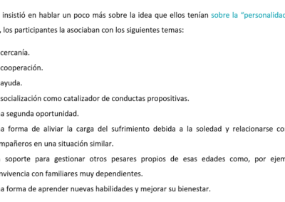
- The idea of identity/personality that they had of the institution started with the activities that were posted on Facebook and accessed from their mobile (as they did not have a computer), in addition to the face-to-face activities.
- Difficulty in mentioning a specific service provided by the centre.
- They were not sure if they had finished a task or did not know how to take the next step or find a contact phone number when this happened.
User Testing
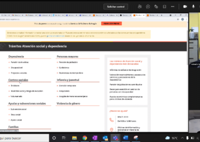
The details of the sample, the minimum characteristics they should have and a script of the whole interaction were structured (e.g. they had not have much experience with the web and to spot them in advance a couple of screening questions were asked).
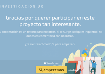
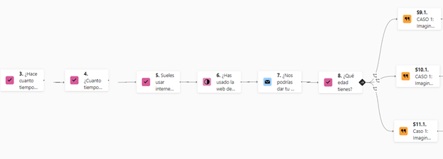
The recruitment of the users was done with Calendly so that they could choose day and time. Three questionnaires were prepared for each age segment with the Typeform tool (you can still access it by clicking https://form.typeform.com/to/tJqBOSNU?typeform-source=marketingsolutions.typeform.com). This then allowed us to make an in-group comparison and thus enrich the analysis. The structure of the form was three use cases or concrete tasks that they had to perform on the web while commenting their impressions out loud and then answering a series of questions related to that task.
Both the tasks and the questions were generated from the pain points found in the focus group and interviews. The aim was to dimension these qualitative findings and to find new pain points obtained from the live experience.
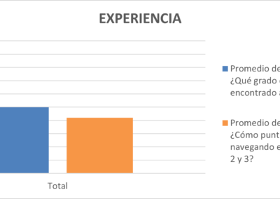
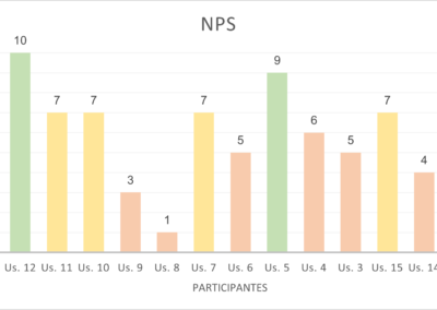
As a distinctive element compared to other sessions held in the past, this time we took the opportunity to make a first measurement of NPS and CES.
Some of the interesting conclusions were:
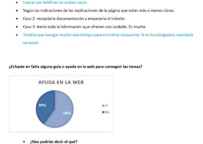
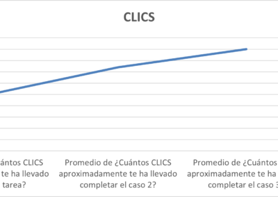
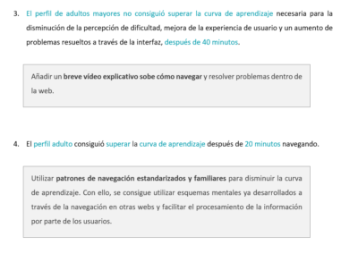
- Older people the more they browsed the less they managed to perform the tasks, adults the more they browsed the better they performed, and young people as they start from other mental schemas from other digital environments some tasks they performed in a few clicks and others not without learning effects.
- The poor usability of the browser also became evident.
- The need to highlight what the person is going to find in the links.
- The need to add a small explanatory video for the most frequent procedures.
- Etc.
UX Benchmarking
For the benchmarking we used 3 competitors from other Autonomous Communities, evaluating the objective of the communication modules of the website according to the needs of the users that we had found in order to find interesting solutions.
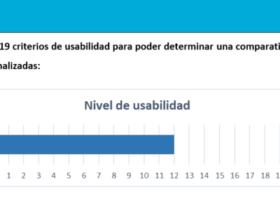
In parallel we also evaluated the navigation architecture of each of them, and we also made a checklist of the 19 main usability criteria that each of them fulfilled in order to compare them.
Heuristic Analysis
For the benchmarking we used 3 competitors from other Autonomous Communities, evaluating the objective of the communication modules of the website according to the needs of the users that we had found in order to find interesting solutions.
- Home (Header)
- Navigation system (Top menu, Secondary menu, Footer, Search engines, Thematic submenus, Internal links underneath, Tabs, Filters, Breadcrumbs, Pagination, Back link)
- Internal pages and components (Internal pages: procedures, Listing pages, Informational messages: alerts and errors, Buttons, Other interaction areas: icons)
- Display on devices and browsers (Header, Body, Footer)
Different screen resolutions
Conclusions on device visualisation
For each section we highlighted where any of Jakob Nielsen’s usability rules were being broken. Despite having been proposed more than 30 years ago, they are still valid today as they are more than accepted by the entire UX community.
After pointing out some good and bad practices and identifying the problem with these criteria, we proposed a solution using a decision matrix, in which we prioritised the one with the greatest impact and least technical complexity, as we wanted to avoid an exponential effect on the project’s development.
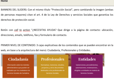
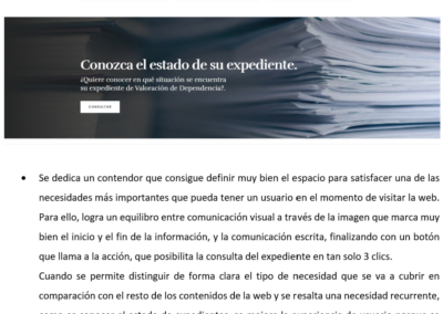
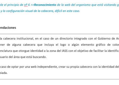
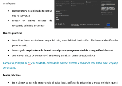
You can see the structure and some conclusions in the images on the right.
Accessibility Analysis
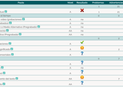
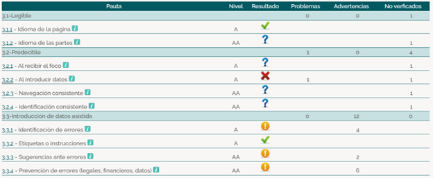
The evaluation of the level of accessibility of the web portal was mainly carried out using these two automatic evaluators:
- TAW: a tool developed by the CTIC Foundation, headquarters of the Spanish office of the W3C.
- Accesi.org
- Tingtun Checker
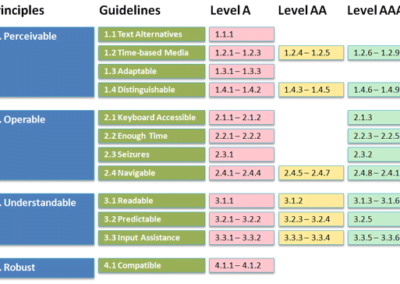
Basically it was concluded that the web portal of the institution should comply, as a minimum, with level AA according to the WCAG 2.0. (so that it can gradually adapt to a WCAG 2.1.) This implies that all pages and electronic documents of the IASS portal should comply, as a minimum, with 25 level A requirements and the 13 level AA conformity criteria, i.e. a total of 38.
Card Sorting
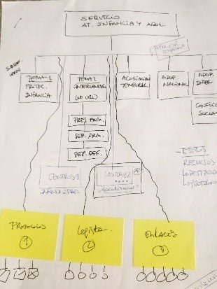
A technique called Cart Sorting was chosen to elaborate the architecture of the proposal for the new web prototype.
The aim was to observe how the participant naturally and spontaneously classifies the contents according to his or her mental model, in other words, according to the natural hierarchy of contents that the participant would expect to find.
The web architecture was reorganised on the basis of this analysis, taking into account the main categories by age segment (the same as used in the initial studies) and reorganising the subcategories L1, L2 and L3 in a much more natural way to facilitate navigation.
Wireframes
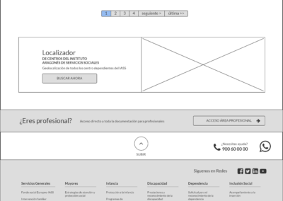
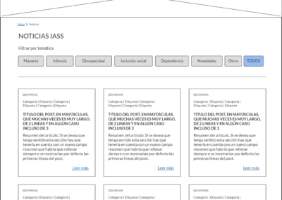
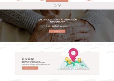
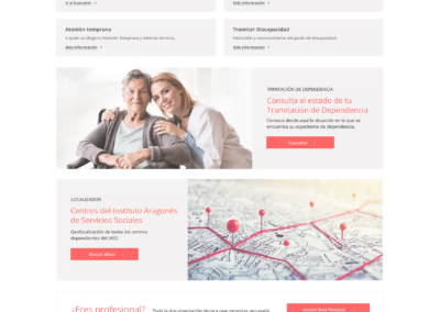
Wireframes are a prototype of the intended user experience design of the digital product. For this purpose, all graphic details were omitted in order to facilitate an adequate representation of all the conclusions and indications obtained so far and a basic form of navigation between buttons was simulated. From this skeleton, three graphic designs with different styles were then proposed, one for each designer.
To elaborate this initial navigation model, a tool called Balsamiq was used, which allows for a collaborative environment in which several designers work in parallel.
The Results
The result was one of the most beautiful projects in which I have participated and in which almost all the most common UX Researcher methodologies, both qualitative and quantitative, could be put into practice.
